“Em Movimento” graphic design was an interesting book project inspired by XIX century Scientists notebooks. In this book the renowned brazilian professor Ângela Santos tells us about the history of many modern physiotherapy techniques, its introduction in Brazil and her experience applying these techniques for years in her clinical work.
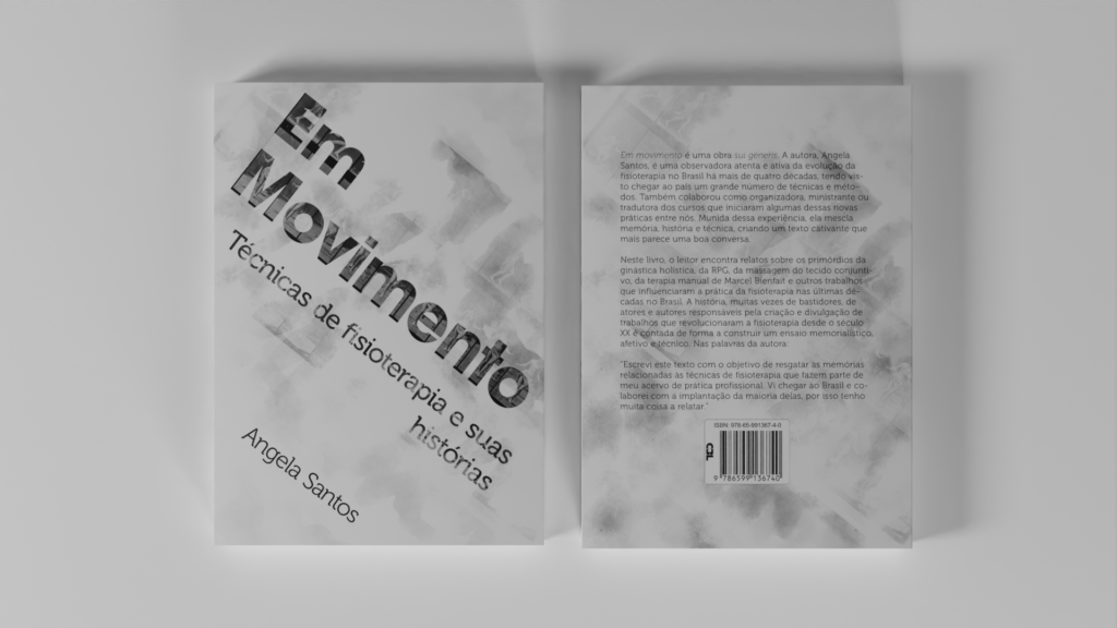
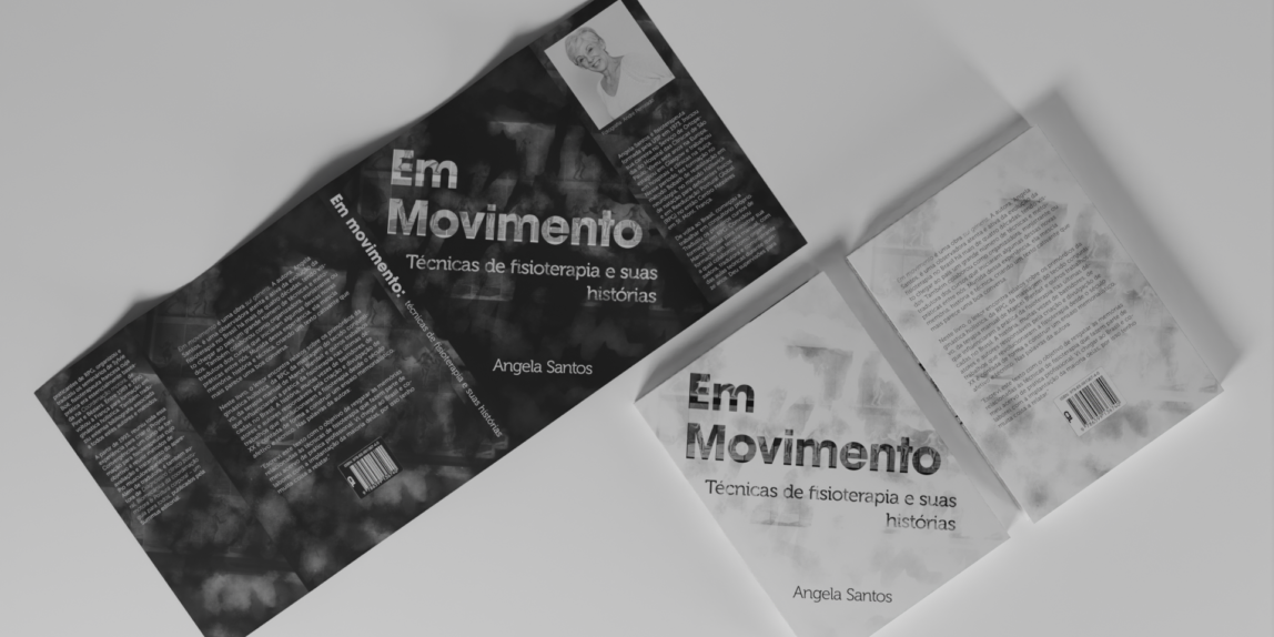
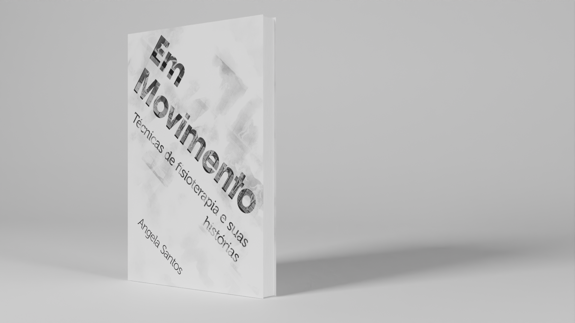
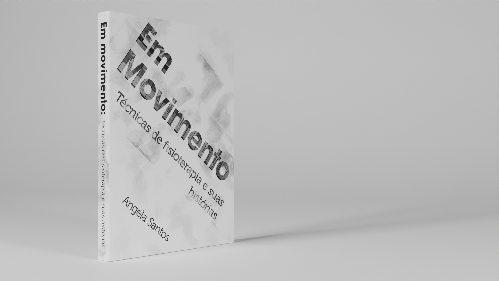
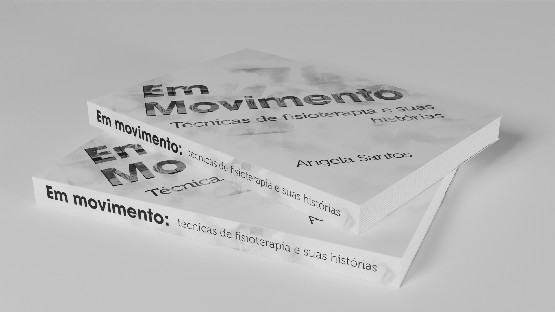
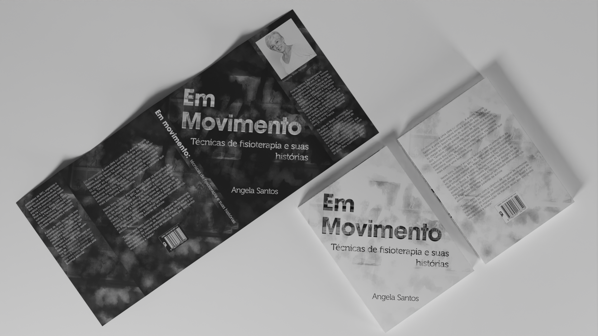
For the book cover I chose to use a picture of Muybridge movement studies and played with transparency using digital watercolor. My intention here was to establish a link with the illustrations I made for “Em Movimento”. Later in development we decided to add a dust jacket with the cover colors inverted. This was made with the intention to protect the white cover and open room to the author’s bio.
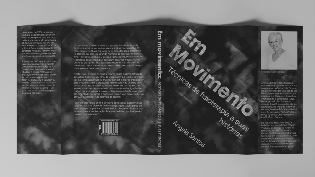
Another reason that led us to design a cover jacket was a difficult choice between two cover options I created. One of them was dark and quite elegant, but I thought that it was important for the reader that the cover inspire the same feeling as the pages of the book:

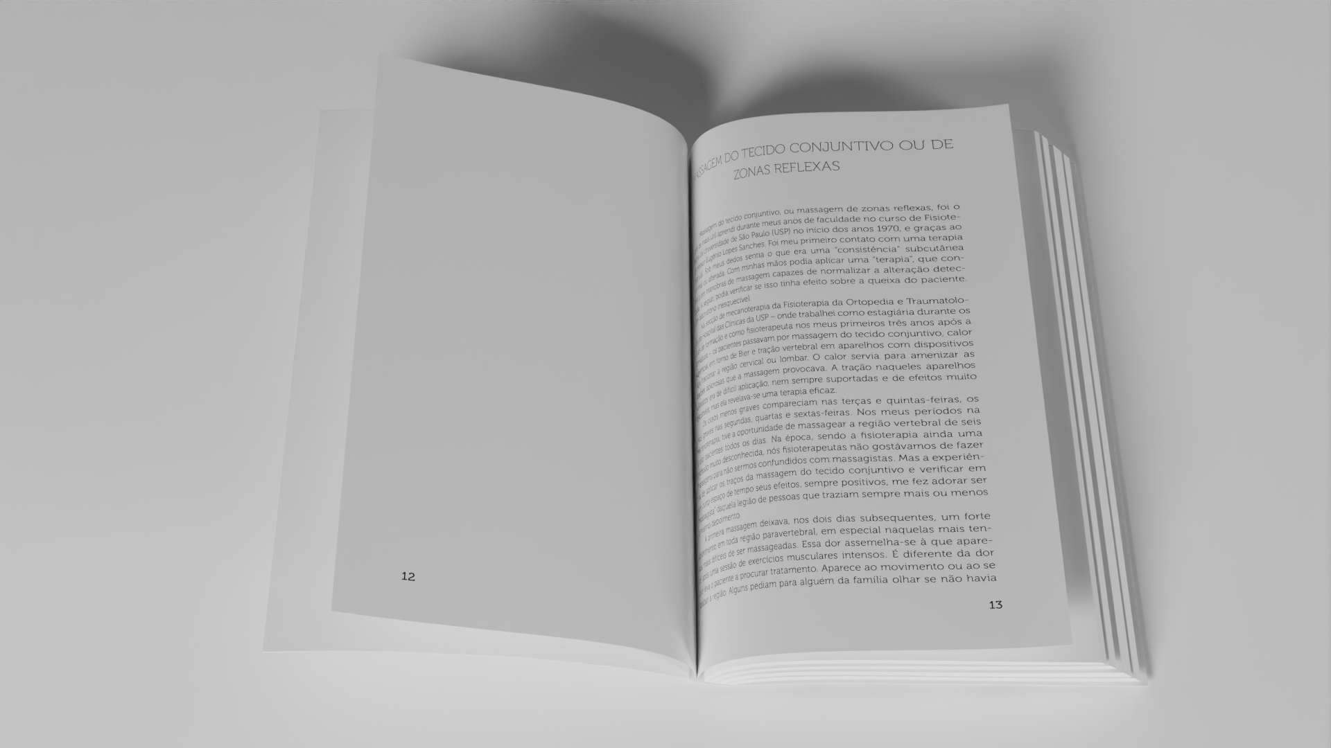
The interior of the “Em Movimento” graphic design has two different layouts: One for the book as a whole, where Ângela tolds us the history and details of the techniques. And the other designed specifically for the fifth chapter, where the autor reproduces her personal notes. This chapter was originally thought to be printed on a different paper to emphasize the feeling of borrowing Angela’s personal notebook. But later, we decided to emulate the paper by printing a soft watercolor paper texture below the text. Although it was less of an impressive solution, I think that the printed texture worked very well. Also we used a handwritten font to maintain this feeling through this chapter.


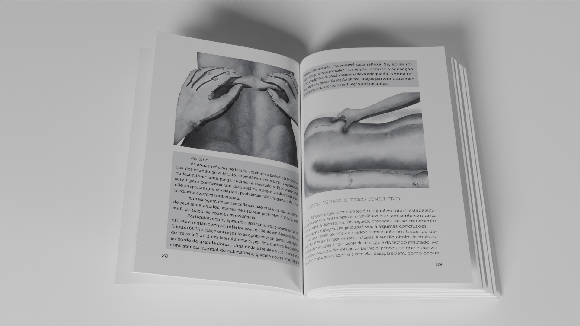
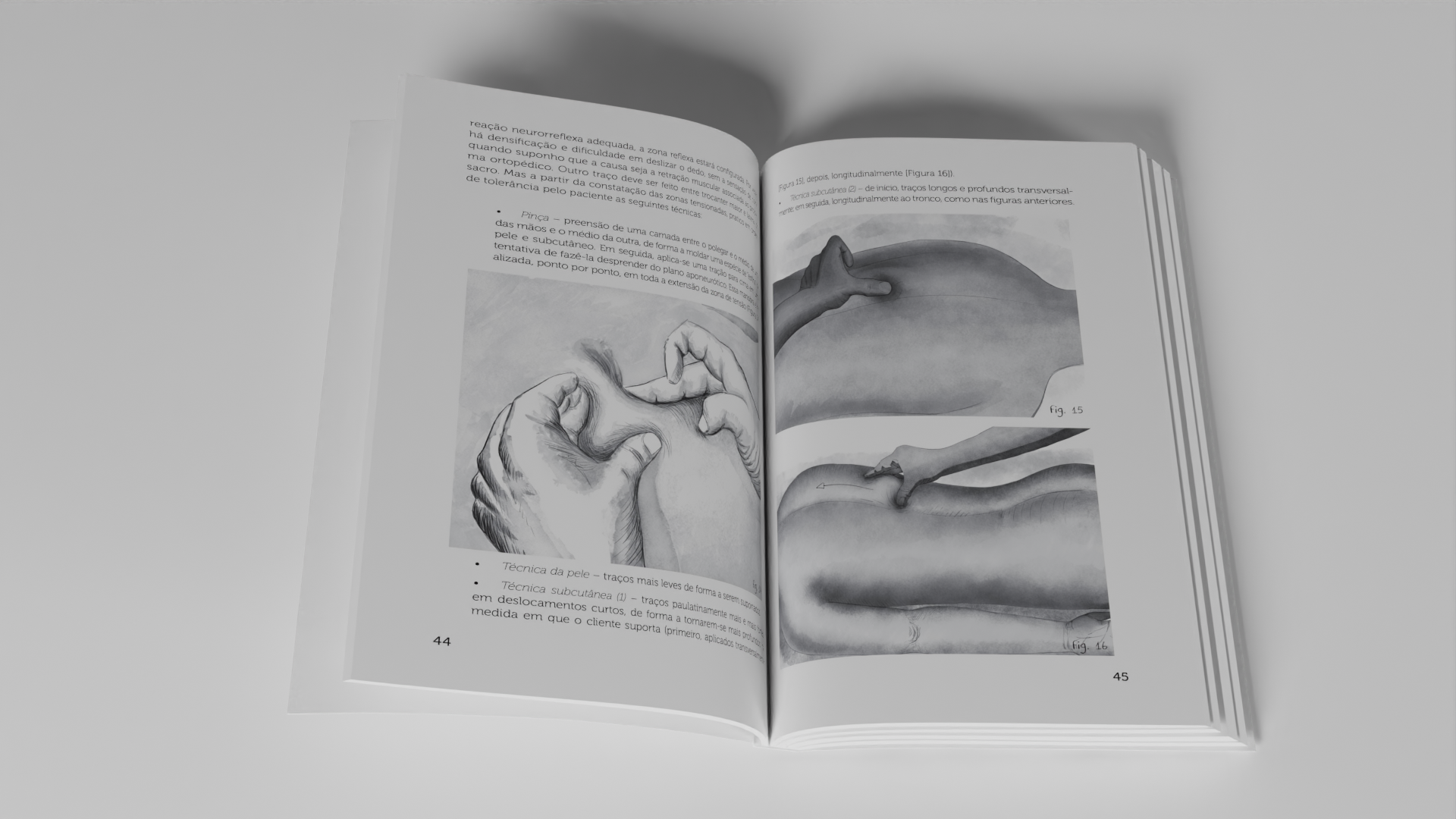
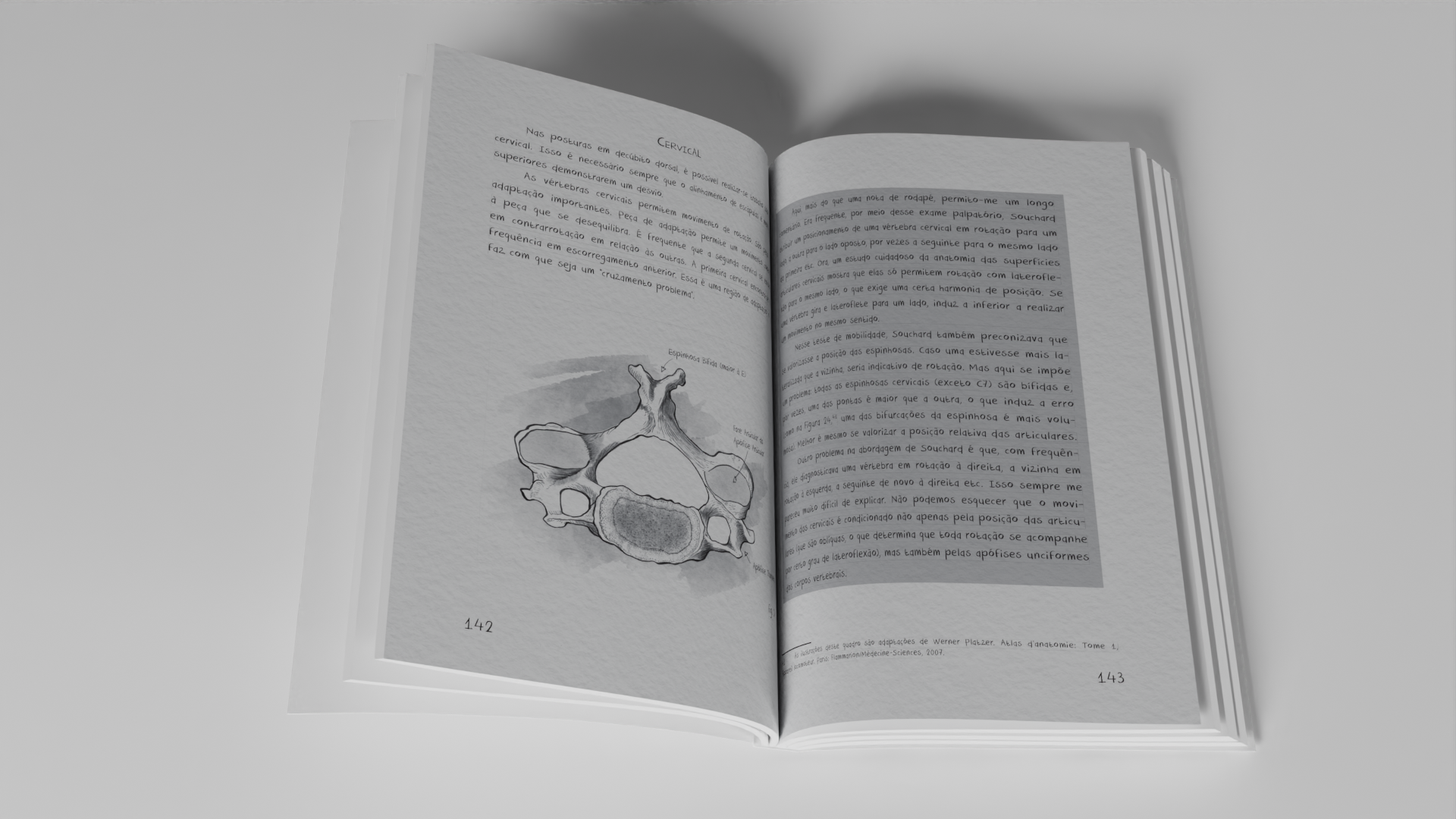
Você precisa fazer login para comentar.