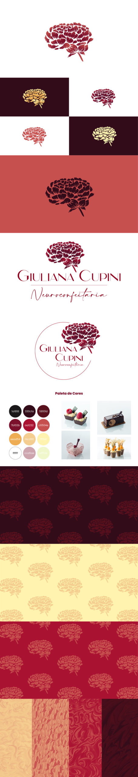
Giuliana Cupini – Neuroconfeitaria is a baker with an awesome project: To involve all of our senses and explore the gastronomic experience in all of its glory, taking us into an indescribable journey. Her original logo uses an elegant typography and an interesting idea: a peony resembling a brain. This image reflects her ambition and her remarkable skill in the making of candy flowers. But despite the beautiful image, the original logo was made in lineart, with too many lines without weight, making it really difficult to understand on social media. Also the colors were a little too cold and distant from the baking universe, whitch was making the logo representation confusing.
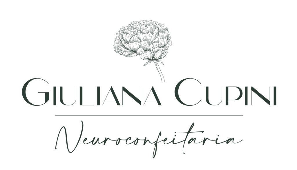
To design the new logo I kept the original idea and the typography and focused on the problems. First I tried to preserve the original lineart and add some weight, but it didn’t work well enough. Then I tried a different approach and had some painting experiences in Krita as if I was painting in a traditional style. It took some time to adapt to another medium, but it was worth it. And for the colors I chose to use Giuliana’s candy colors in order to bring to the flower the sweet aspect it was lacking before.
Você precisa fazer login para comentar.